AGAmanda Gangadeen
All work
B2C SaaS Logistics E-commerce

Shippsy: a shipping dashboard customers stopped calling about

Canadians use Shippsy to buy from U.S. stores. I redesigned its dashboard across desktop and mobile so customers could track, clear customs and pick up without contacting support.

RoleSenior UX/UI Designer, Stallion
Timeline6 weeks
PlatformsDesktop + mobile
Worked withSupport, cross-border ops, devs

Welcome back, Diana

Here's a quick look at your shipments. Get support

3Action required
2Pre-transit
2In transit
2Shippsy approval
2Ready for pickup
1Complete
Shipment IDUS carrier trackingCreatedLatest updateStatus
40464_SHP2302H5WDAB 123 456 789 CDApr 18, 2023On route to CAIn transit
Apr 23 · Sanborn, NYEst. Apr 24 · Richmond, BC
40464_SHP2302H5WDAB 123 456 789 CDApr 18, 2023Pending detailsAction required
40464_SHP2302H5WDAB 123 456 789 CDApr 18, 2023ProcessingShippsy approval
40464_SHP2302H5WDAB 123 456 789 CDApr 18, 2023Arrived at ShippsyReady for pickup
40464_SHP2302H5WDAB 123 456 789 CDApr 18, 2023Order completedComplete
40464_SHP2302H5WDAB 123 456 789 CDApr 18, 2023Pre-sortingPre-transit
40464_SHP2302H5WDAB 123 456 789 CDApr 18, 2023Pending requestAction required
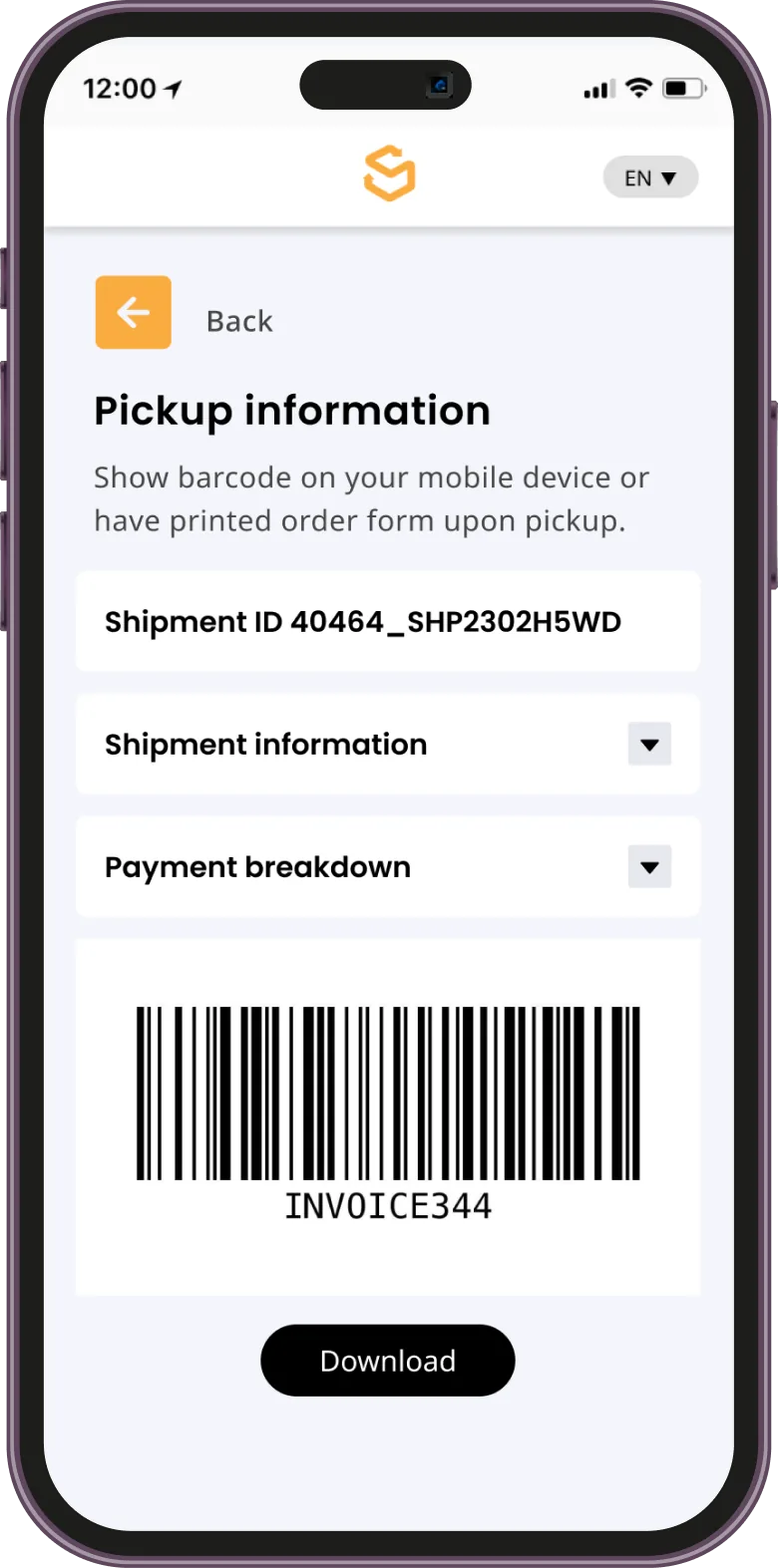
Shippsy mobile pickup screen with barcode
15 → 6Ambiguous shipment statuses consolidated into clear, actionable ones
No printerPickup barcodes moved to mobile, ending a top cause of failed pickups
1000sCross-border shoppers relying on the dashboard every day

The problem

Support was swamped with the same questions: where's my package, when will it clear customs, why this fee, how do I pick it up?

Pickup required a barcode printed in advance. Many users couldn't find it or didn't know they needed it, which meant repeat tickets and failed pickups.

Research

I partnered with the Customer Support Manager and Cross Border Specialist to surface recurring pain points, then mapped the end-to-end shipment journey to find where tracking, customs and pickup broke down.

User interviews Full site audit Competitive analysis IA review Ops workflow review Stakeholder workshops

Key decisions

01

15 statuses became 6

Interviews and workshops showed users consistently misread the 15 tracking statuses. I consolidated them into 6, each with short copy explaining where the shipment is and what, if anything, the user needs to do.

  1. 1Status summary. Six colour-coded counts at a glance.
  2. 2Live route. Where a shipment is between the US and Canada.
  3. 3Action required. One place for everything waiting on the customer.
  4. 4Row actions. Details, request or pay from any shipment.
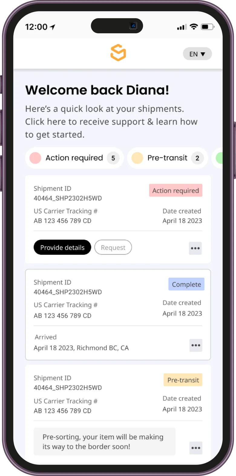
Welcome back, Diana

Here's a quick look at your shipments. Get support

3Action required
2Pre-transit
2In transit
2Shippsy approval
2Ready for pickup
1Complete
Shipment IDUS carrier trackingCreatedLatest updateStatus
40464_SHP2302H5WDAB 123 456 789 CDApr 18, 2023On route to CAIn transit
Apr 23 · Sanborn, NYEst. Apr 24 · Richmond, BC
40464_SHP2302H5WDAB 123 456 789 CDApr 18, 2023Pending detailsAction required
40464_SHP2302H5WDAB 123 456 789 CDApr 18, 2023ProcessingShippsy approval
40464_SHP2302H5WDAB 123 456 789 CDApr 18, 2023Arrived at ShippsyReady for pickup
40464_SHP2302H5WDAB 123 456 789 CDApr 18, 2023Order completedComplete
40464_SHP2302H5WDAB 123 456 789 CDApr 18, 2023Pre-sortingPre-transit
40464_SHP2302H5WDAB 123 456 789 CDApr 18, 2023Pending requestAction required
Mobile home showing shipments that need action Pickup information screen with a barcode to show at the counter
02

Pickup without a printer

Instead of printing a barcode in advance, customers now open it on their phone at the counter, with clear guidance at each step of the shipment's progress.

03

A customs step people trust

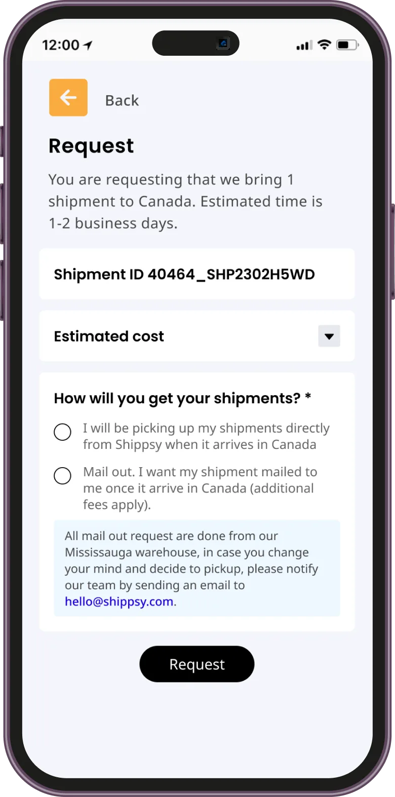
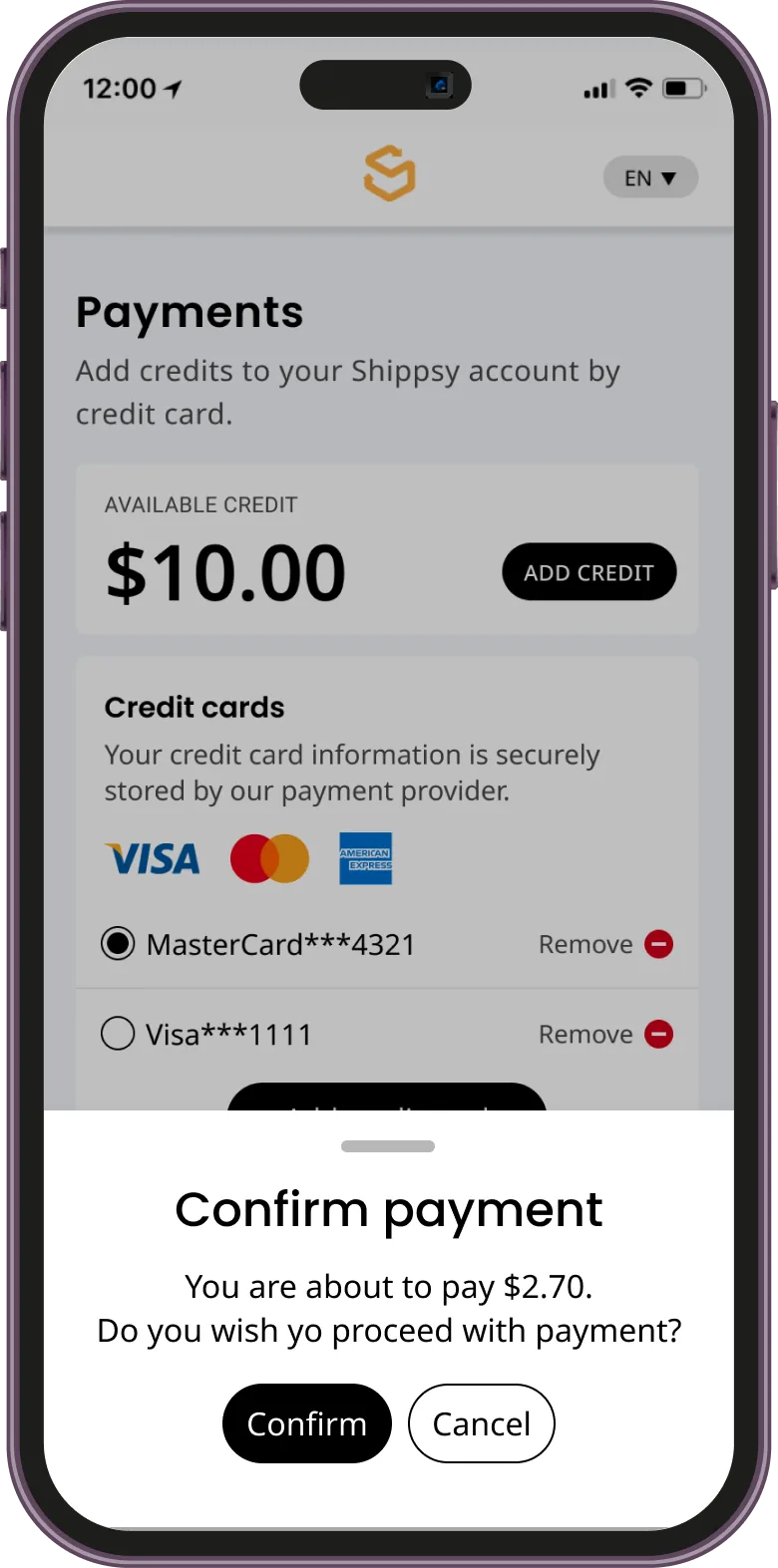
"Provide Details" was required for customs but poorly understood; users weren't sure their submission went through. I added clear requirements, progress indicators and confirmation states.

Request screen asking how the shipment will be collected, with clear guidance Confirm payment bottom sheet before a charge goes through
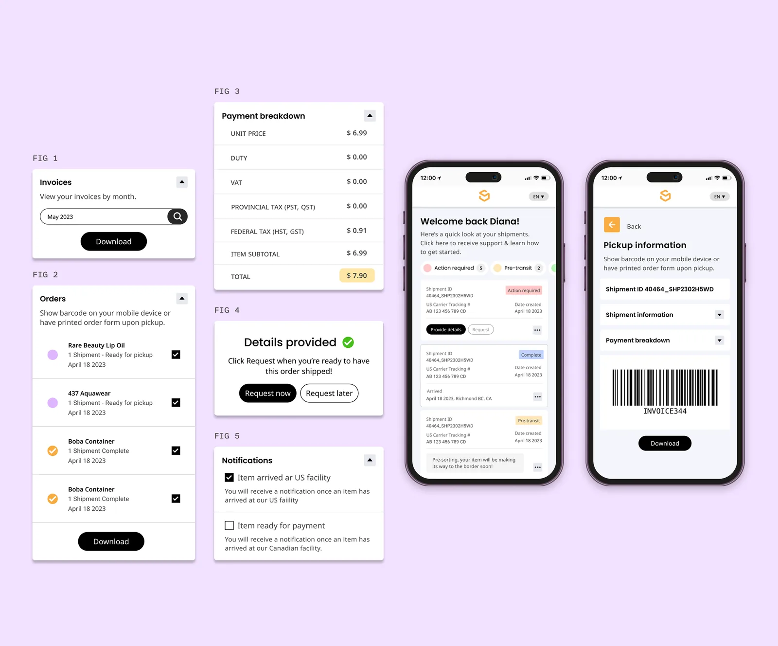
Component figures: invoice search, orders, payment breakdown, details provided confirmation, notification settings, and two mobile screens
04

Transparency for everyone, speed for power users

Detailed cost breakdowns and customizable notifications answered "why this fee?" before it became a ticket. For finance teams, fast invoice search and download.

Outcome

A clearer, faster dashboard that thousands of cross-border shoppers rely on every day, with a mobile experience at parity with desktop. Confusion dropped, self-service went up, and support teams got their time back.

"Amanda's wealth of experience translated into valuable insights. She exuded positivity, truly enhancing our workplace."
DZDiana ZhengMy manager at Stallion · now Senior Partnerships Manager at Orita

What I learned

The best brief I got was the support inbox: almost every ticket traced back to a status nobody understood, so I learned to count confusion before designing for it. Cutting 15 statuses to 6 showed me that clarity often comes from removing things, not adding them, while power users still got the detail they needed in the cost breakdowns. Next time I’d measure ticket volume per status from day one, to show the drop with real numbers.

Hiring a senior UX/UI designer?

I'm open to full-time and contract roles, working remotely with teams in Europe and North America.

Email me LinkedIn amanda.danielle.gangadeen@gmail.com